How to Supercharge Your Website’s Contact Form (and Attract Better Freelance Clients)
If your websites contact form only collects name, email, and message, you're missing out on a huge opportunity to get high quality freelance leads.


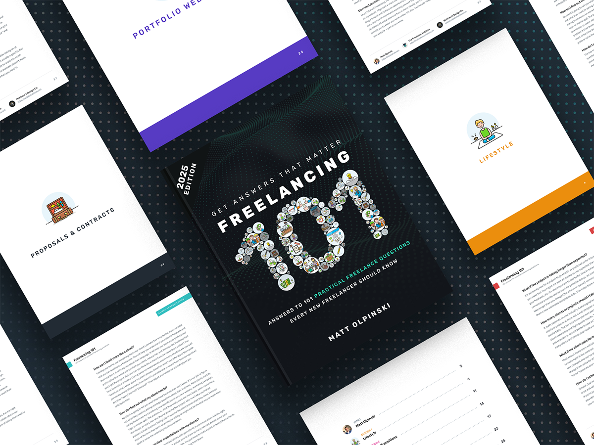
New to freelancing? Start here with my FREE 100+ tip guide.
Price your services, find better clients, and avoid beginner mistakes all in one clear, practical book.
When it comes to freelancing, there are two main strategies for attracting clients. The first is outbound marketing, where you push messages out to potential customers in an attempt to pursue their business. The second is inbound marketing where you create content that attracts potential clients to your business.
I’m a huge advocate for attracting freelance clients to your business rather than chasing after them through job boards and cold emails.
This is most commonly be achieved through a website where you promote your work and services, then give prospective clients a way to contact you about their project. But what you may not realize is just how effective contact forms can be (and how ineffective most of them really are).
In fact, the contact page is one of the most valuable pages on your website. Yet, it’s the page freelancers focus on the least.
If your contact form only collects name, email, and message, or if you simply have an email link on your website, you’re probably not getting many high-quality leads. When you do get a new lead, it’s probably a hassle to determine if they’re a good fit and collect the information you need to write a proposal.
An effective contact form not only asks better questions, but asks them in a better order to maximize conversions. It also facilitates better discussions and streamlines your process. In this article, I’ll explain why you need a contact form and how to maximize its potential.

What’s Wrong With an Email Link?
If you don’t have a contact form, I’d strongly encourage you to add one to your website. Remember, the entire purpose of your website is to attract freelance clients and generate high-quality leads. Unfortunately, email links are not an effective way to collect leads. Here’s why:
- The call-to-action is extremely weak. Even if you have great work and explain your services clearly, asking a prospective client to “Get in Touch” by sending you an email is just not compelling and instantly feels like a chore.
- It requires too much effort from the client. When clients have to take too many steps to contact you, they get distracted and give up. Technology has trained us to give up VERY easily when a task is too difficult. So even if the client thinks you’re a good fit for their project, they may not put in the effort to copy your email link, open their email composer, wonder what to say, type something up, and send the email. There’s simply too much friction and cognitive burden.
- It doesn’t prompt the client to provide helpful information. When left to their own devices, clients will compose an email with very little helpful information. It’s unwise to assume they know what information you need or what questions you have about their project. That means it will require a lot more unpaid time and effort to get the information you need on follow-up calls or emails.
- The client is required to leave your website. When the client clicks your email link and gets back to their inbox, it’s far too easy for them to get distracted and ultimately fail to contact you.
- It feels amateur. When all you have is an email link on a contact page, it feels like you’ve made a bare minimum effort. Do you want the client to feel like you’re making them do all the work or that you’ve done your best to help them through your process?
- You can’t track conversions. With an email link, you’ll never be able to see how many people viewed the link compared to how many people actually emailed you. Therefore, you won’t know how well the link is or isn’t working.
My recommendation is to include both an email link AND a contact form on your website. That gives clients the option to contact you any way they prefer.
There’s nothing wrong with having an email link on your website, but it’s just not an effective lead-generation strategy on its own.
Can’t add a contact form to your website?
If you can’t add a contact form to your website, use a hosted solution such as TypeForm or Google Forms and link to that form on your website.

The Problem With Most Contact Forms
The biggest problem with most contact forms is that they don’t collect enough valuable information. Asking the client to type a detailed message into a single message box is only a small improvement over asking them to send you an email.
In fact, they might prefer to compose an email on their own depending on the design of your form. For example, it might be easier to type a long message and include attachments in Gmail rather than trying to use the form on your website.
But even if a client successfully fills out your contact form, you haven’t asked them for any specific information. That means you’ll have to invest more time and effort into follow-up calls and emails when you could have just asked them more questions directly in the form. Here’s the problem with most forms:
- They’re not enticing. Let’s face it, no one actually enjoys filling out contact forms. Name, email, and message are boring and do nothing to help you stand out.
- They don’t collect valuable information. Your client gave you their name, email, and, if you’re lucky, a brief overview of their project. Congratulations, you collected as little information as possible in a way that’s not standardized at all.
- They don’t function properly. Forms that don’t function properly are the worst. If your form doesn’t submit or doesn’t handle errors well, it can be a frustrating first experience for a potential client and they may not try again.

Why Improve Your Contact Form?
Your contact page is the most important page on your website. At that point, the client has reviewed your work and services, determined that you might be a good fit for their project, and decided to contact you.
When they get to your contact page, you want to make their first experience communicating with you smooth and seamless.
Optimizing your contact form not only gives potential clients a great first impression and facilitates better discussions, it also streamlines your process.
When you ask the right questions in your contact form, you’ll instantly know if you’re a good fit to work with that client. You’ll also have some sense of what the most appropriate next step is (phone call, more emails, etc). This will help you reduce the time it takes you to go from initial discussions to writing a proposal.

Creating a More Effective Form
By now you’ve probably guessed that better contact forms ask better questions. So what questions should you ask? To determine that, think about what information you need so that you can write a compelling proposal:
- Project Background
- Business Goals
- Scope of Work
- Services Needed
- Budget Expectations
- Timeline Expectations
All of that information can easily be collected in a contact form. That way, every time you get a new project lead from your website, you’ll have everything you need to quickly determine if you’re a good fit to work with that client on their project.
This is a great way to standardize your onboarding process. The problem is that when you add fields for name, email, and additional details, the form can become quite long and intimidating.
Low-Value vs. High-Value Information
When you start by asking for low-value information such as name and email at the top of the form, you decrease the likelihood a client will complete the form. The client hasn’t committed to sharing valuable information and the form feels generic and boring from the start.
When you start by asking for high-value information such as the type of project, the client immediately commits to sharing valuable information. That means it’s more likely they’ll complete the form. Name and email can be collected at the bottom of the form instead.
Dynamic Contact Forms & Conditional Logic
Dynamic contact forms show or hide fields based on certain conditions using conditional logic. For example, you can ask questions one at a time by hiding the next field until the previous one has been completed or contains a specific answer.
The logic looks something like this:
- If the answer to Question A is equal to Option 1 show Question B
- If the answer to Question B contains “Marketing” show Question C
- If the answer Question C is greater than $5,000 hide Question D
This technique makes long forms feel much more approachable and less intimidating. It also makes them feel more interesting and unique — which helps you stand out while increasing engagement and conversions!
But you can take this functionality a step further by asking unique follow-up questions depending on the users answers to previous questions in the form.
For example, if the user indicates they need a website redesign, you can follow up by asking if they need design only or design and development. However, if they chose something like logo design, you can ask a different question instead or skip the follow-up question entirely.

So, how do you create a dynamic contact form?
I use GravityForms since all my websites are built using WordPress. It’s a paid plugin, but well worth it for the value it adds to my website. There are many other form plugins available for WordPress as well.
You can also use TypeForm, JotForm, HubSpot, or Google Forms to create dynamic contact forms and link to them from your website.
No matter what plugin or platform you use, dynamic forms are created using something called conditional logic. So, if you want to know if a specific plugin or platform supports this type of functionality, look for conditional logic.
You can learn more about conditional logic here.
Examples of Effective Contact Forms
Over the years, I’ve refined the design and format of the contact forms I use on my website and my client websites. Here are a few links where you can see this approach in action!
- Matthew’s Design Co.
- Knaub Home Solutions
- TaxExact
- Rachel’s Edit
- The Freelance Institute
- Papa & Pokey Productions
Putting It All Together
Now that I’ve explained all these techniques, let’s put them together.
Your website is a powerful lead-generation tool for your freelance business. But a weak contact page can actually work against you. Email links and basic Name / Email / Message forms aren’t engaging and won’t solicit high-value information.
Better contact forms ask better questions (and in a better order).
Start by asking for high-value information such as the type of project they need completed, budget and timeline expectations, and their business goals.
Ask for low-value information such as name and email at the end of the form instead. Give them one field called Additional Details where they can write whatever they want.
To prevent your contact form from feeling too intimidating, use conditional logic to intelligently show or hide certain fields as the user answers questions.
Pro Tip: If you’re a web designer or developer, use this technique on your client projects to maximize conversions!
Want to learn more about maximizing the potential of your portfolio website? Check out my 50-page eBook all about making strategic improvements to your website to attract high-value clients to your freelancing business.
Stop chasing down work and transform your portfolio website into a powerful client magnet that will help your freelance business thrive.

You Might Also Like These

How to Earn Freelance Income Without Any Clients
Did you know that you can start earning money right away, without any freelance clients? All you have to do is sell your own work!

How to Avoid Working With Bad Freelance Clients
I only experience problems with clients when I break my own rules. Accepting that position, attitude, and perspective is what enables you to learn and grow from your mistakes and make better decisions in…

What is Project Roadmapping and When Should You Use It?
Don't waste hours talking with a freelance clients only to have them "go in a different direction". Use Project Roadmapping to build trust, provide value, and get paid to plan the project!